Human Skull and Rose

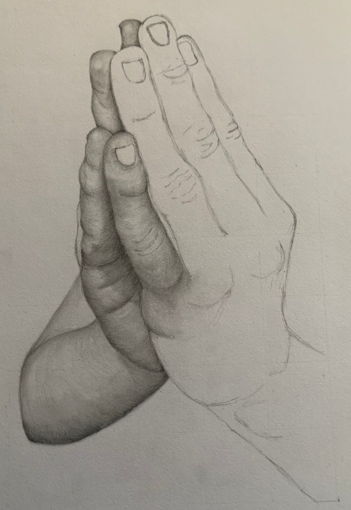
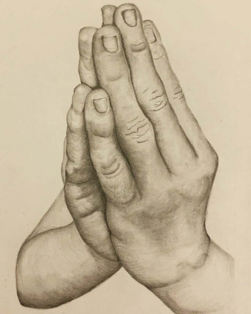
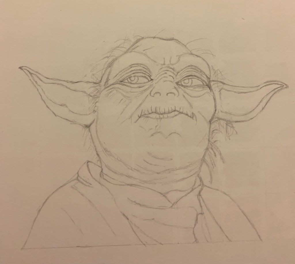
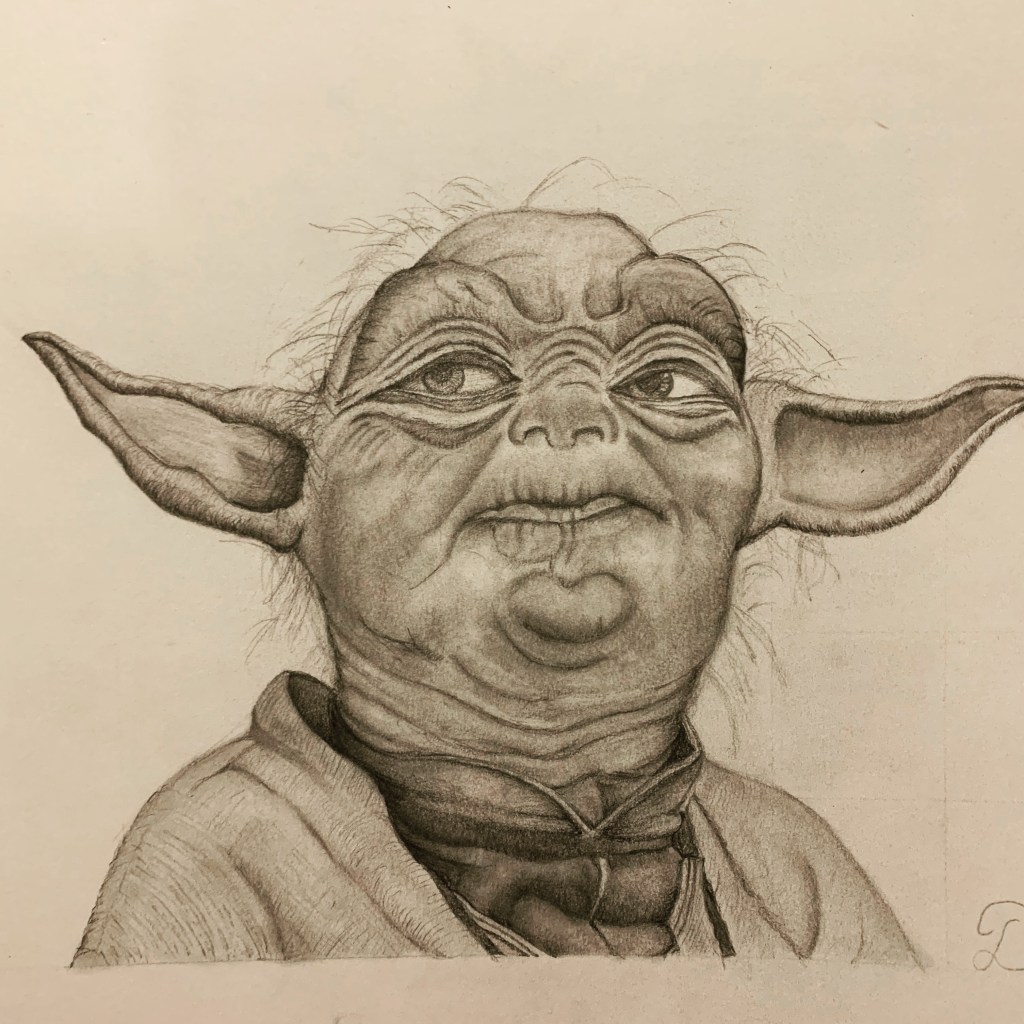
For some time, I have wanted to draw the human skull as I have seen so many drawn in many different styles. I like to think that my particular style is black and grey realism, and whilst I’m still at the early stages of my drawing career, I like to think that in the ten weeks that I have been drawing, my technique has really improved compared to what I was drawing in the beginning. For each sketch that I complete, I always scrutinise carefully looking at the composition, shading and line work that I have drawn to see what I could improve on next time. Some of my earlier sketches that I have completed have always needed a lot of improvement, so eventually, I will have another attempt at those sketches to see how far I have progressed.

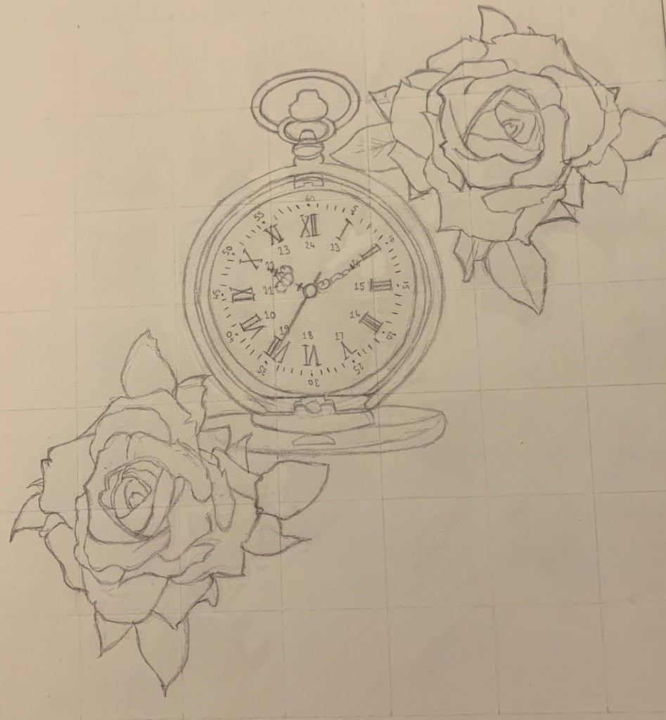
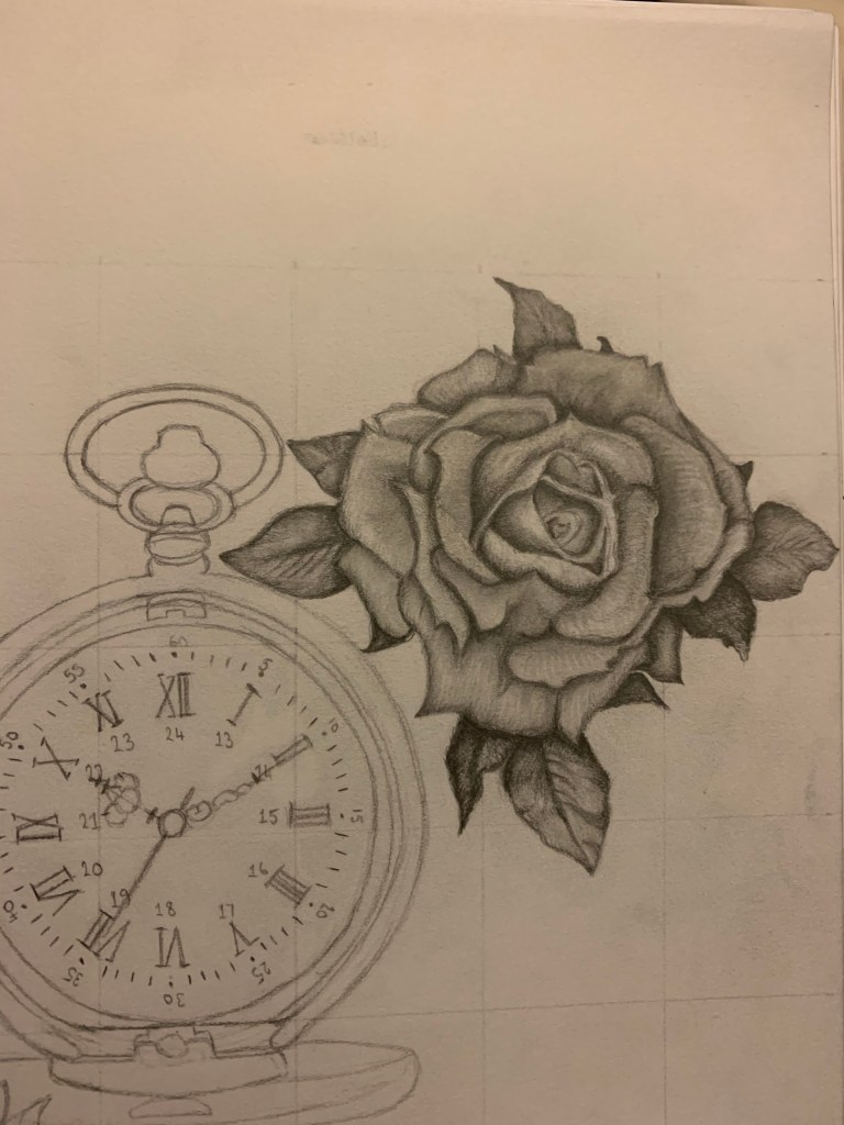
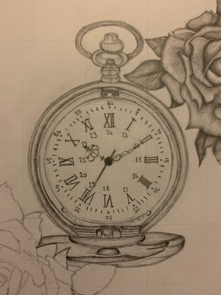
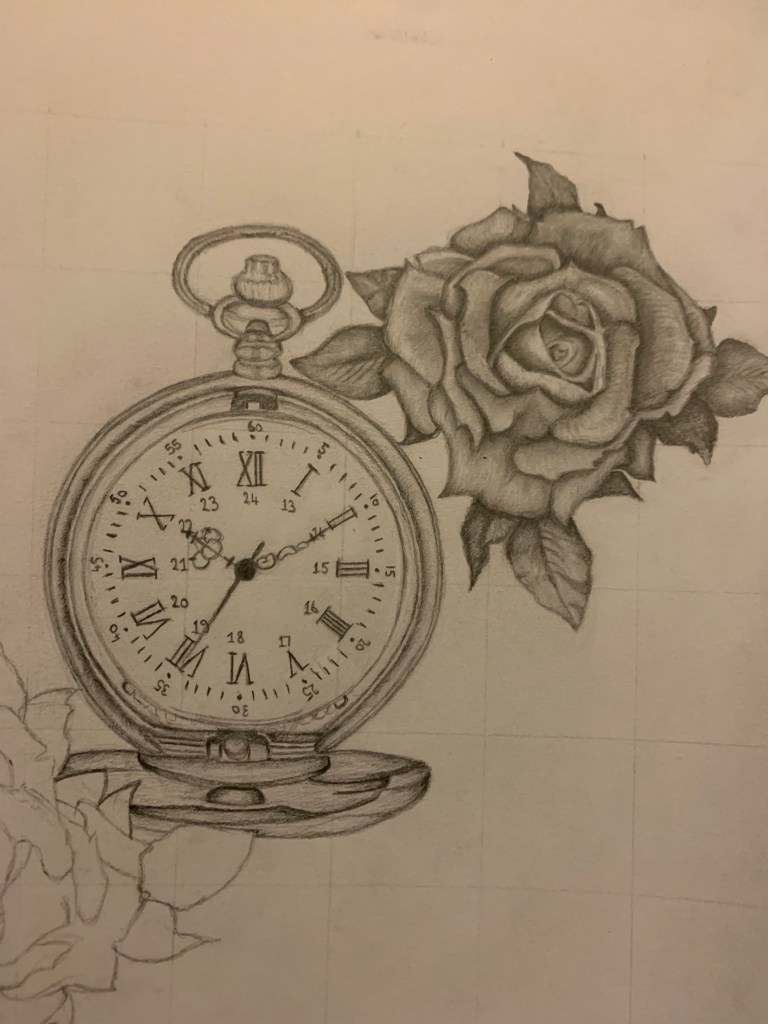
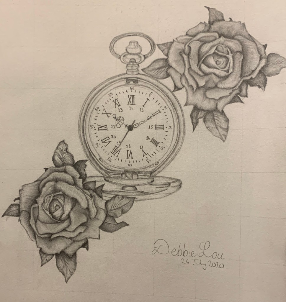
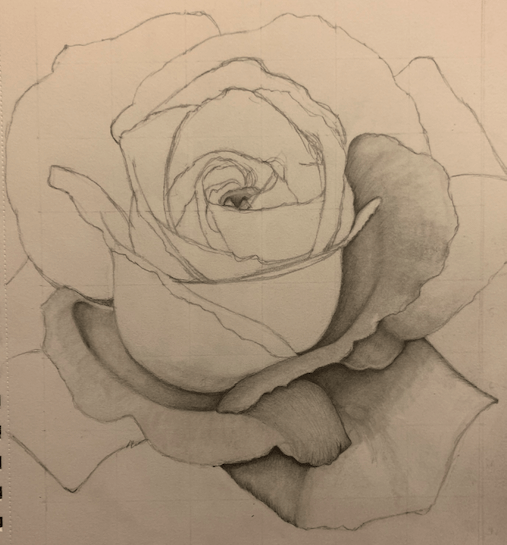
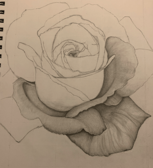
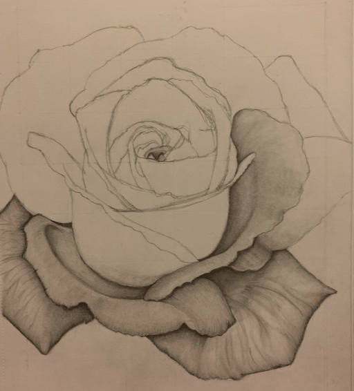
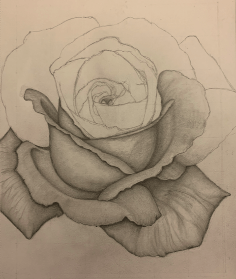
When I found the skull I was looking for, I also decided that I wanted to add a rose to it as I wanted to add extra composition to the picture. For reference, I used the original picture for the darker tone, and then edited it to make the picture lighter. I used a combination of both skull pictures as a reference to shade the skull. I didn’t want the skull to be too dark as I wanted it to have depth. With the rose being added to the picture, there had to be contrast between the two images. Here is the finished sketch:

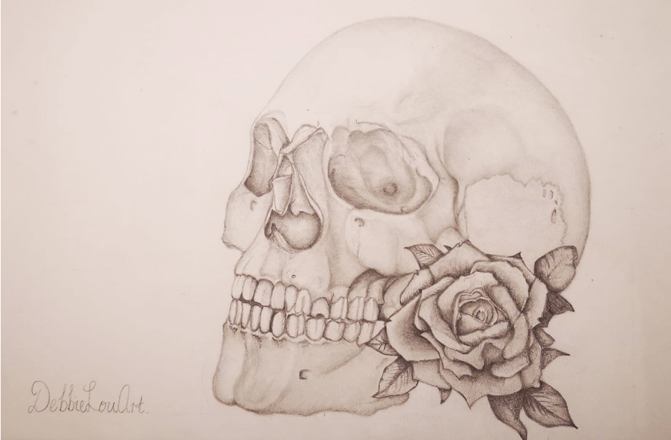
I’m really pleased with how the sketch looks, and I particularly like the soft tones at the top of the skull. The rose has been completed in dark shades due to the deep colour of the red of the original rose picture. What I also like about this finished sketch is that it can also be used as a tattoo design. Whilst the drawing is not perfect, it’s one of my favourite drawings that I have completed so far, although I am wondering whether I will ever get to the stage where I am 100% happy with a drawing. Maybe this is something that all artists experience whether they are amateur like myself, or professional. I love drawing it’s great for escapism and makes me feel relaxed at the end of a long day.

Anakin Skywalker

My latest piece of work is Anakin Skywalker from the 2008 film Star Wars: The Clone Wars. My son has grown up watching episodes I, II, and III of the Star Wars films and was also a huge fan of the animated Clone Wars film which lead to the hugely successful TV series. I was looking for a new subject matter to draw and was going along the lines of drawing a character from either a TV show or film; my son suggested Anakin Skywalker, so I searched for an image online and found the following:

I wasn’t too concerned with the background detail, I wanted to get the proportions correct for the figure as I wanted to give the impression that his left hand was further back like the the image above shows. I also decided that I was going to complete the picture in black and grey, but I had to be mindful of the fact that there needed to be contrast as some of the areas of the image is quite dark in places. It took me a week to complete the picture, and this is how it looks:

I’m really pleased with how this has turned out, especially the face. I found another picture which showed more of his figure, so I was able to add more towards the end of the sketch. I think I managed to get the dimensions correct with his arm which is holding the lightsaber. Whilst the clothing on the right arm in the original image is quite dark, I decided that I wouldn’t shade it as dark; I used my own interpretation. I decided to use darker tone in the layers of his clothes to make what he is wearing more three-dimensional.

My son is really pleased with this drawing and wants to put the picture in a frame and put it on his wall. I’ve got a few other ideas in mind for future projects, and I am currently working on one at the moment, which I will share once it is completed. It can be a stand-alone picture or could be used as a tattoo design.

In the past week, I’ve also set up my own art Facebook page where I share my sketches, so feel free to follow, the more the merrier: https://www.facebook.com/DebbieLouArt.

New Tattoo Design

I’ve just finished my latest tattoo design, and this time, I thought I would design one for myself. I have a gap on my left forearm which needs filling. The last tattoo that I had was on my lower left arm and goes from the wrist to the inside crease of the elbow. This particular tattoo took six hours to do, and was completed at the beginning of 2019, so it has been a while since I sat for a tattoo. I wanted to take my time in designing a tattoo, as (1). It’s an investment, and (2). It’s going to be permanent, so I wanted to think about what my interests were, and how it would fit with the other tattoos on my left arm. There is a definite subject matter, so I didn’t want anything random that looked out of place.

The two tattoos that I currently have are three roses at the top of my arm, and the lower inside part of my arm has two roses divided with some writing which says “You are the writer of your own story”. As you can tell, I love flowers, and although I want more flowers, this time I want different flowers. I also thought about what else I liked as well as I wanted to include that in my design. I have a passion for genealogy and have my own business researching family trees for people. I’m also fascinated with the science behind DNA testing. I finally decided what I would like and this is the finished image:

The finished image is a double helix DNA strand with two daisies. I began to initially think about this tattoo design in June 2019, and I was thinking of having a trio of daisies on my forearm. I’m glad that I didn’t rush this design and that I took into account one of my other passions; genealogy. I think the design is so much more complete now. I have booked my tattoo and will be having it done in the next few weeks; I can’t wait. I’ll share a picture of what it looks like when it has been done, and then I will share a picture once it has healed – exciting times.

If I ever decide to have another tattoo, then the design would take into account my other day job which is a library assistant, and it would also include a flower theme; perhaps a stack of books with flowers laid across the top.

Hands

When I was younger, I liked to draw hands, but it was always my left hand that I drew. This time around, I decided that I wanted to draw someone else’s hands, so that I could draw them together, catching them from a different angle and working in shade and light. I wanted to draw my son’s hands, so I got him to position them together, and then I took a few photos from different angles before I settled on the position that I was happy with.

I think my style of art is leaning towards photo realism, and I’m happy to go with that for the time-being while I practice getting my lines and shading correct. I began with the grid method purely to make sure that the height and angle was in proportion, and then I added the detail afterwards. This is the outline of the hands:

I’m pleased with the initial outline, and I can already see the similarity between my sketch and my son’s hands. The next part of the process is to begin the shading. In my previous drawings, I didn’t particularly have a method of where I would begin the shading; I would usually start at the bottom, but that makes the outer area of the page dirty. When beginning the shading on this sketch, I decided to be more methodical by starting at the top left-hand side of the image:

The darker part of the sketch is the left-hand side due to the light source coming from the top right. When progressing further over towards the right, I had to make sure that the rest of the drawing wasn’t dark. The shape of the second finger, at this stage, needed to be altered slightly as the finger joint is quite large in proportion to the rest of the finger. The next part was also going to be difficult because although the knuckles looked like they were going to be easy to shade, they were quite a challenge to do. I had numerous attempts at the knuckles, and below is the finished image:

I’m quite pleased with the finished drawing, although the knuckles could definitely be improved upon. I’ll definitely draw more hands as I like the way they come in all different shapes, sizes and textures. I think I am improving my shading techniques as my finished sketches aren’t as dark as they used to be.

I’m now beginning my next project, which is a tattoo design for myself, and will go on my left arm. My left arm already has two large tattoos on it, so this final one has to fit in with the design of the other two so that it doesn’t look out of place. The design I’m currently working on incorporates flowers, but also has an extra added piece to it that reflects another passion that I have. All will be revealed soon.

New Project

Since getting back into drawing, I always like to ensure that I have a drawing project on the go. I generally have a busy day working my day job for a university library, and in the evenings, I’m carrying out genealogy research for clients for my business, as well as studying for my undergraduate degree. I’m lucky in that I have two jobs that I really enjoy and I’m also enjoying studying for my degree.

Despite enjoying my work and studying, I know that it is essential that I have some down time to relax, which is why I like to continuously have an art project to work on. I’m constantly on the lookout for the next or future project, whether it’s a sketch I want to work on or a possible tattoo design. The project that I am currently working on is hands. I used to like drawing hands when I was younger and decided that I wanted to have another try to see how they would turn out. When I was younger, I used to draw my left hand, but this time, I wanted to draw someone else’s hands. I asked my son to position his hands in front of him and then took a photo. I have now sketched a rough outline and this is how it looks:

I’m pleased with how the initial sketch has turned out and I think I have the proportion correct. The lines are drawn in where the knuckles and wrist bones are so the positioning is marked out and I know where to shade them. The next stage is to begin shading which should really make the hands come alive. Looking at the photo that I’m using for reference, the shading shouldn’t be too dark; the darkest part of the drawing is situated on the left-hand side of the image, so they light source is coming from the right. I will share the finished picture soon along with how I progressed with the work.

I already have some ideas for the following project, which I think will be a tattoo design, possibly for myself. All be revealed soon.

Yoda

Having already completed a Stormtrooper helmet, I wanted to attempt another character from Star Wars. As my husband is a huge fan, I decided to let him choose who and what I would draw next, and he chose Yoda. We looked at a couple of images and he went with one where Yoda was looking up; in a thinking pose. In order for me to draw the correct proportions, I drew a grid in my sketchbook and sketched a rough outline:

My intention was to have an outline on paper before beginning the shading; I knew I would probably alter parts of the drawing as I went along. For shading, I used a standard 2H pencil and a 0.5mm mechanical pencil as well as using paper stumps for blending. I began shading the ears first before moving on to the head:

At this stage, I was reasonably pleased with the progress, but felt that maybe the mouth could be altered slightly as well as the left-hand side of the face. I decided to continue with the remainder of the picture, and then have another look at the areas that I wasn’t happy with. This is the finished picture:

Initially, I wasn’t overly happy with the finished sketch; I was disappointed and felt that I could have completed it better. At the time, I wasn’t sure that the completed sketch actually looked like Yoda, because I couldn’t see it. Maybe it was because I had spent so much time trying to correct the drawing, and getting frustrated that I just couldn’t see it in the right way. I had finished the drawing late on the 30th July, and even though I wasn’t overly happy, I shared it to my social media accounts. I decided right at the beginning of returning to drawing that no matter what the finished drawing looked like, I would share my drawings with people. Having had a good night’s sleep and looking at the drawing again, I am a lot happier with it.

In future, if it’s getting too late in the evening to draw, or I’m finding it difficult to get part of the drawing correct, then I would benefit from putting the drawing down and coming back to it another time. I would definitely draw another picture of Yoda as the character has an interesting profile and is excellent for shading.

Tattoo Design

After a couple of people suggested that I could be a tattoo artist from seeing my drawings, and because this is something that I am unable to do due to having uncontrolled epilepsy, I decided that I would start designing tattoos instead.

Since I had just completed a rose drawing, and I have a couple of large rose tattoos on my left arm, I decided that my first tattoo design would include roses. This is the initial rough design:

I felt that it was important to make sure that the positioning was correct before beginning the shading. The image was drawn using my Derwent Precision HB mechanical pencil. I like the feel and control that I have when using it.

I began shading the top rose first:

At this stage, I’m happy with how the shading is progressing, but I’m trying to be mindful of the fact that the image is a lot smaller than I am used to, and the image I am using to work on the shading is quite dark; I didn’t want the roses to come out dark as I wanted to retain the dimensions of the rose and ensure that it still stands out on the final picture. The following is the completed version of the rose:

The completed image is quite dark, but I think that it still reflects a three-dimensional image. The next stage of the process was to work on the fob watch and to ensure that the lines are correct. This stage of the process was slightly more difficult than the rose. At this stage, I invested in some more mechanical pencils, and I’m pleased that I did because I prefer the feel of them compared to the standard sketching pencils, although I do still use them.

I spent quite a bit of time on the fob watch shading, re-shading and re-drawing the lines, and this is the finished result:

For the first time drawing and shading in this amount of detail, I’m pleased with the end result. I think I need more practice, and future pieces of work will include drawing fob watches so that I can concentrate more on the detail and the shading. This is what it looks like in context with the finished top rose:

The bottom rose I shaded using some of the new mechanical pencils, in particular using a 0.5mm mechanical HB pencil and a standard 2H. Using a thinner led helped a lot more with the shading, and I found it easier on this rose. The following is the completed image:

I’m really pleased with how this looks, but you can see the difference in quality from the top rose to the bottom rose, which is what I thought would occur, and I think that the bottom rose has come out a lot better. I definitely think that the more that I add to my art supplies, the better the quality my art will become. Drawing regularly will also increase my artistic abilities.

When you compare my latest drawings to my earlier drawings, I already think that I have come a long way. My confidence and my abilities are improving and will continue to do so the more that I draw. I’m always looking for my next project, and I have at least another four ideas to work with in the future.

New Art Equipment

As I am still relatively new to drawing, (I began about five weeks ago), I still need to build up my drawing materials and sketch books. I bought myself a Derwent Precision mechanical HB pencil a week or so ago to see what it’s like to sketch with. I really enjoy the grip compared to the usual pencils that I sketch with as it feels like I have more control over the drawing. Whilst deciding on the brand, I saw that there was other types of pencil available, but it was deciding which ones I should get. After reading a few reviews, I decided that I would buy the following:

Geology Mechanical Pencils

These are the Bellofy Mechanical Pencils; the gold ones are 2H, HB, and 2B and the leads can also be sharpened. The ones on the right are 0.5, 0.7, and 0.9mm HB pencils. Each pencil has its own refill leads. Two erasures also came with it. I’m really pleased with the pencils; I used the gold ones first to shade a rose that I am currently working on. I still need some practice, as the shading on the rose that I was working on came out slightly dark, but I am still learning and this can only improve.

I wanted to know how I could ensure that my shading would be lighter but still have more depth, and after carrying out some research, I found that using the H and HB pencils would benefit the current project that I’m working on. The current project that I’m working on is two roses and a fob watch. With the first rose complete (and slightly dark) I began to work on the fob watch using the 0.5mm HB mechanical pencil and a 2H non-mechanical pencil. The shading has come out a lot better using harder pencils instead of using the softer B pencils. You’ll be able to see the difference once I share the completed project. The fob watch is now complete, and I’m about to begin shading on the other rose. I’m fully expecting there to be contrast between both roses, but that’s ok as I know I’m still learning.

With all of these pencils loose in my sketch bag, I decided to get myself a pencil case to keep everything in so that they didn’t get lost or damaged. I carried out a bit of research, and this is the case that I bought:

I wanted a hard case to provide the contents with some protection, and I’m pleased with this one as all of the mechanical pencils, leads, erasures, and the paper stumps fit inside it:

It all fits inside perfectly, and I’m really happy with the purchase. If I want to just take a sketch book out and about with me, and all my pencils, then this is perfect.

New Project

As soon as I complete a project, I like to try and start a new one straight away, and by being able to draw in the evenings, it helps me to wind down and relax before I go to bed. At the moment, I’m working from home due to the coronavirus, so I’m in my office at home in front of a couple of laptops and I’m not getting a lot of fresh air. Once I finish my day job, at 6pm, I’m either researching for my genealogy business, which I enjoy doing, or I am studying for my undergraduate degree for Information and Library studies. I love my day job, my genealogy business and studying for my degree equally, but it involves a lot of computer work. It can be quite exhausting as I have dyslexia and the coping strategies that I have in place to help me can be quite tiring so I need an outlet to unwind and help me to relax.

Drawing helps me stay away from my smartphone and tablet and I can relax and focus on something totally different. I’m so glad I found drawing again, and it’s something I wish I had done earlier. I can’t imagine not doing it now, and I’ve only been doing it for a month. Whilst there is a lot of room for improvement in my drawing, I think I am progressing well after nearly thirty years away from regular drawing. I think drawing comes naturally to me due to having dyslexia; I call it my neuro diverse superpower.

I’ve been sharing my recent creations on Facebook and Twitter as I’m really proud of what I have achieved in such a short time. I have had a lot of compliments from people on my drawings for which I really appreciate. Three people, in particular, in the past week have said that I should train to be a tattoo artist. As much as I would love to do that, unfortunately, it is something that I am unable to pursue as I have epilepsy which is not controlled by medication, so it would be unsafe for me to do this. With those comments in mind, I thought I would have a go at designing a tattoo. I already have four and will definitely get another, but still not sure what to have at the moment. The following image is a rough sketch of my design:

I chose this design as I love roses and I like the old style fob watches. I searched for a picture of a fob watch and also for rose heads. I printed out the pictures of the roses and then cut them out and arranged them around the watch. The sketch is looking quite basic at the moment, but I will start to shade the drawing to finish it off to make it more effective. Hopefully once my drawings improve, I can start designing tattoos for people.

Rose

Roses have always been my favourite flower; I like them so much that I have two large tattoos on my left arm:

Rose tattoo from early 2017

The above tattoo took about six hours and was completed in one day with a few breaks. My next rose tattoo I had done in February 2019:

This tattoo took slightly longer and was a bit sore but was worth it. Both tattoos have been completed by two different artists, but that’s ok as I like it that they are slightly different from each other.

I thought I would have a go at drawing a rose as I wanted a challenge. I knew that it was going to be difficult due to the positioning of the petals as well as the shading; I didn’t want the end result to be too dark and flat looking. Just like the previous project, I took photos of my progress of the drawing of the rose. I started off by drawing a grid in my sketch book so that I could draw a rough sketch of the rose and to get the positioning as accurate as possible. I then began the process of shading using my HB Derwent Precision mechanical pencil, an F and a B pencil along with paper stumps to blend:

I was pleased with the initial layout of the rose, but found it slightly difficult with the shading to begin with as I wanted certain petals to look as if they were standing up more than the others. The middle-sized paper stump helped with the blending and enabled me to shade accurately in different directions. The bottom right-hand petal was difficult initially as the darker part needed to look lower than the petals above it, but the edge needed to be curving down slightly. This petal took a bit of time to master.

Looking at the completed petal, it appears that I have just about been able to overcome that obstacle.

I moved on to the lower left petal and with this one, I had to try and make sure that the front part of the petal was curled into a point whilst ensuring that the petal above it looked like it was hanging over it.

I wanted to start working on the centre of the rose and leave the larger, outer petals to the end. The middle part had to look round at the edge as well as the top part looking three-dimensional. I think I have the three-dimensional part ok, but at this stage, I wasn’t 100% happy with the shape. Time would tell whether or not it would look ok at the end.

By completing further shading on this area of the rose, the shape that I was unhappy with earlier is looking a lot better and in line with the rest of the rose. It’s beginning to take shape.

Although there isn’t much change in the two images, the centre of the rose is coming to life, and I’m happy with how the blending and shading is progressing.

A lot of work has been completed between these two images. I found that I had to re-draw the centre of the rose, as I wasn’t happy with the composition, before I could continue with the shading and blending. I am much more happier with the changes that I made as, previously, it was looking uneven and disproportionate. The following image is the finished piece:

I’m really pleased with how it has turned out, especially as I have never drawn a rose before. As always, there is room for improvement, for example, some of the line work on the larger petals. I’m happy that the shading isn’t dark and that I am constantly aware that I should always begin my shading lightly so that I can build up the darkness of the shades. I enjoyed this project and will definitely draw more flowers, but perhaps add something else to the picture as well.