Elephant #2

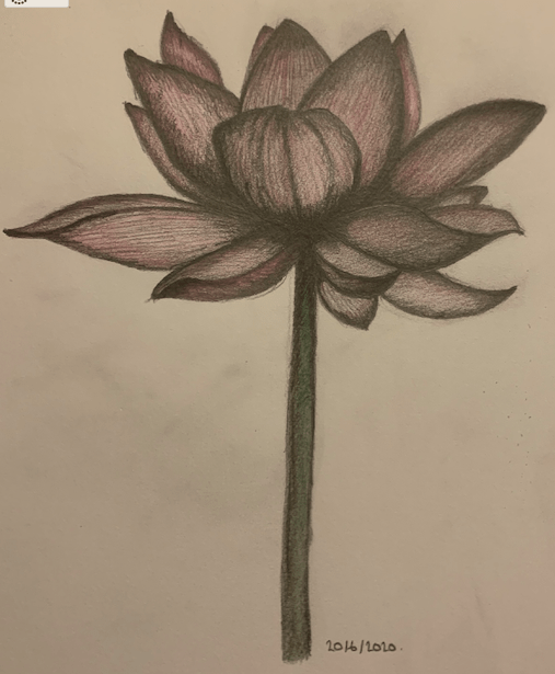
I used the previous drawing of the elephant head that I drew on my iPad as a preparatory drawing for this piece of work. I wanted to do a full composition of an elephant and complete it in colour and whilst I completed the drawing, I decided to take photos of the stages of completion so that you can see how I progressed with this piece of work.

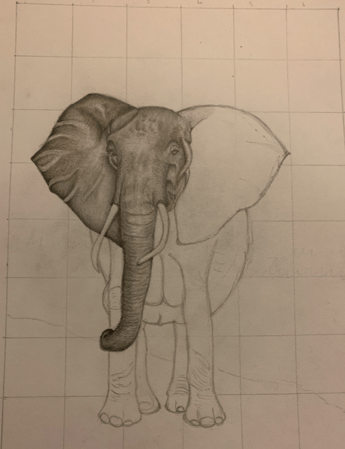
The first stage involved drawing a grid in my sketchbook and then drawing the outline of the elephant:

As you can see, it’s a basic drawing, but at this stage, it was just a matter of getting the composition right before beginning the shading. The shape of the elephant was gradually altered as I progressed with the shading and you can see this in the different photos.

I began the shading by working on the left ear (as you look at the elephant):

The shading on the ear is slowly beginning to bring the elephant to life, but there is still a long way to go. At this stage of the shading, I was using two shades of grey, along with Derwent Precision 0.7mm HB mechanical pencil and an F pencil.

After shading the left ear, I moved on to the face and the trunk:

I felt at this stage that the elephant was really coming to life, and I was trying to get as much texture into the elephant’s head as possible. I noticed from the photo that I was using that the elephant wasn’t just shades of grey, but it was also brown as well, so I introduced a brown colouring pencil into the shading process.

After shading in the face and the trunk, I moved on to the right ear:

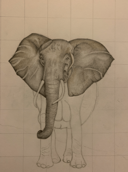
At this stage, I was feeling really pleased with how the elephant was progressing; it was beginning to feel even more life-like. I had to be mindful of the fact that there was going to be a lot of dark colours on the elephant and that I needed to ensure that I start each part of the elephant as light as possible and then build the layers up. Whilst carrying out the shading of the face and the trunk, I found that I was having to constantly re-draw the shape of the tusks, and that I needed to make sure there was the shadow of the tusks on the trunk.

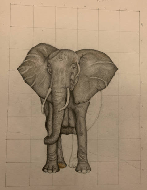
After completing this stage of the elephant, it was time to move on to the legs:

You can see that I have completed a lot more of the elephant when you compare this image to the previous image. I wanted to ensure that there was enough shading around the tusk and the ear on the right-hand side to make the image more three-dimensional. I had also re-drawn the body on the right-hand side to make it less rounded as it didn’t look very proportionate when you compared it to the rest of the elephant.

In this image, three of the legs have now been completed, and the elephant is now growing on the page, and becoming more life-like. At this stage, I was trying to decide what to do with the background once I had completed the shading on the elephant. Backgrounds are not my forte, and at some point, I need to take my sketchbook out with my pencils and practice doing scenery.

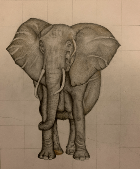
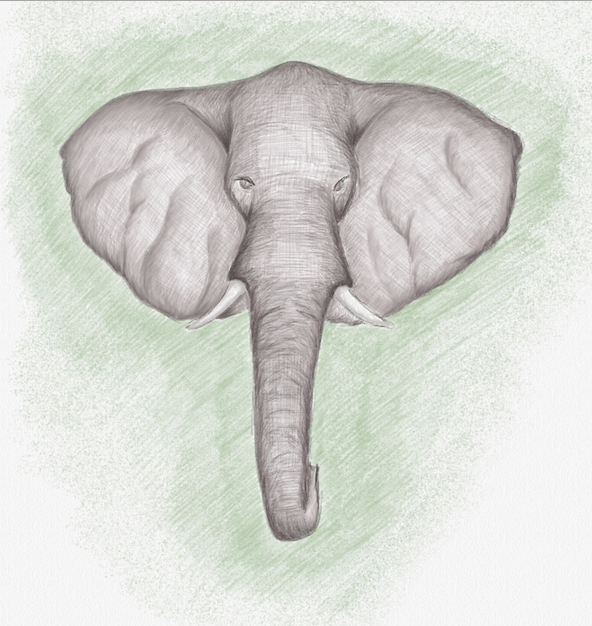
This is the finished image of the elephant. Surprisingly, I found the right-hand side of the body the most difficult to complete; I couldn’t get it to match the rest of the elephant, but after several attempts, I think I managed it. The next stage was to erase the grid and complete the background. This is the finished result:

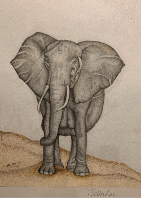
I’m please with the end result as I’ve never drawn an elephant before. There is room for improvement, for example, the markings on the ears could be less prominent. I think the elephant is in proportion and I am particularly pleased with how the face turned out. The background is ok, but I think it would be even better once I have learnt how to draw scenery, and this is something that I can work on. I may even invest in watercolour pencils and try working with alternative media.

Elephant #1

I decided to have another go at drawing on my iPad using the Linea Sketch app, and this time, I decided to draw an elephant. I thought I would try and draw just the head, and if it turned out ok, I could use this as a practice run for drawing the whole elephant. This is how it turned out:

I’m pleased with the finished drawing, as it’s the first time I’ve drawn an elephant, but again, there are some improvements to be made. I was able to use the colour palettes well and began shading lightly so that I could build up the layers of texture. There are different palletes of grey available and each one comes in different shades. The blending tool came into play again, which I used a few times before building more colour on top. The texture of the elephants ears needs to be more subtle rather than being so prominent, but this can be worked on.

Overall, I am pleased with the completed drawing and it has provided me with good preparation of the anatomy of an elephant for when I complete it in full in my sketch book. I think I may do it this way for future projects as (1). it gives me practice using the Linea Sketch app and my Apple pencil, and (2). I can practice with shading, layering and texture before I move on to the larger version of the sketch.

Self-portrait

I used to love drawing portraits when I was younger and I was always drawing portraits of my favourite popstars when I was a teenager. Now that I have got back into drawing, I decided that I would have another attempt at a portrait, but as it was my first time after so many years away from drawing, I decided that I would try and draw a portrait of myself. After scrolling through my photos, I decided I would attempt this photo:

I began by printing the photo out on paper and then drawing a grid of 2x2cm boxes over the image. Next, in my sketch book, I decided that I wanted to draw a bigger image than the one that I had, so I drew a grid of 3x3cm boxes on to the page. Using a grid to lay out my composition helps me space out the features better rather than having them disproportionate. I then proceeded to draw. This is what the finished sketch looks like:

Having not drawn a portrait in about thirty years, I’m pleased with how this has turned out, especially as I had a lot of issues with getting the mouth right and the positioning of the nose. The shading of the lenses on the sunglasses could have been improved too. There also needs to be better shading with the hair as well. I definitely found using the paper stumps beneficial when doing the shading around the nose and the mouth as it made the pencil lines a lot more subtle, and it meant that I could get the shading around the nose area more accurate. I found that all I needed to sketch for the nose was the area around the nostrils; everything else was blended.

Overall, I think the whole process has gone well, and as always there is room for improvement, but practice does make perfect and there is always a learning curve when drawing. I have noticed that when I am out and about I’m always looking at objects as if they are going to be my next piece of work. I find that I’m looking at the profile of objects and the colour as well as different shades. I suppose it’s a bit like a photographer wanting to get the composition correct when they want to take a photograph.

Realism

My paper stumps came through the post and I immediately wanted to try them out, mainly to see whether they made much of a difference to blending than using my finger. I decided that I wanted to draw an eye and after taking various photos of my own eye, found a suitable photo to use that wasn’t covered in shadow. This is the end result:

I drew a grid over the printed photo and then drew a larger grid in my sketch book as I wanted the sketch to be a lot bigger than the original photo so that it would provide me with a bigger platform to work on. I also wanted the drawing to be in the correct proportion and angle.

The paper stumps that I bought came in three sizes, and I worked primarily with the smaller one due to the detail of the eye. I was pleasantly surprised with the end result as the blending was much more accurate, and the added bonus was that my hands weren’t covered in pencil. The main issue with this sketch is that the right side of the iris should have been slightly rounder; it looks a bit flat on that side. I was able to use the smaller paper stump for blending the eyeball and to make it look more realistic and cleaner. If I had used my finger to blend then the finished drawing wouldn’t have looked so clean. I used the medium-sized paper stump to blend around the outer area of the eye. This helped give the eye more depth and made it more three-dimensional.

For my first attempt at blending using paper stumps, I’m really pleased with the outcome as it allowed me to draw and shade the eye in great detail. This is my favourite piece of work so far and I’m glad I purchased the stumps. I’m gradually expanding my art equipment and I now need to find a decent white pencil. I’ve recently bought a large selection of colouring pencils and I’m going to start completing some of my work in colour. I’ve always enjoyed shading as it looks so effective, but I need to come out of my comfort zone and try different materials.

Digital Drawing in Colour

On the back of the success of my first drawing on my iPad, I thought I would attempt to draw an animal, but this time, complete it in colour to see what colours and shades were available to me. After looking through different pictures, I decided to draw a cow; the following is the finished result:

I found that shading in colour on my iPad was initially difficult and not as straight forward as using a standard colouring pencil. I think that I was initially pressing too heavily which makes the pencil marks come out heavier – exactly the same as if you were using pencil and paper. This was the same difficulty that I had when drawing and shading the lotus flower. This is another learning curve for me, and something that I will need to take into account when I complete my next drawing on my iPad. The blending tool came into play quite a lot when completing this drawing, and I spent quite a bit of time on the nose. I was pleased with the colours that were available to me as well as the shades within the colours.

For the first time using colour in a digital drawing, it’s not a bad drawing and still looks three-dimensional, but there is plenty of room for improvement. I think that the colours on the nose could have been blended better, and the texture on the forehead has room for improvement. I really enjoy using this method for sketching and shading. It works well if I just want to sit down for a while and draw and I don’t want to get all my art equipment out, although you can’t beat using the proper equipment.

Digital Drawing

I decided to invest in an Apple Pencil for my iPad as I wanted to have a go at digital drawing. Having carried out extensive research to decide which app I wanted to use, it came down to two: Procreate and Linea Sketch. Both apps would be suitable to my needs, but I opted for Linea Sketch as it was free and I didn’t know how my sketches were going to turn out, and whether digital drawing was going to be for me. If I think that this is going to be suitable media for me, then I can always upgrade to Procreate later.

The next process for me was to find a subject matter for me to draw. My husband and son are huge Star Wars fans, and I decided I would attempt to draw a Stormtrooper helmet. This is the finished result:

For my first attempt at digital drawing, I’m really pleased with the finished product. What I like about Linea Sketch is that you can look at a recording of how you completed your drawing. I need to familiarise myself further with how Linea Sketch works and perhaps I can look at tutorials for this. I think that it is quite effective, and I particularly like the blending tool.

Looking at the eyes on the helmet, the left eye (as you look at the helmet) is a slightly different shape to the other and could have done with being slightly rounder on the outside edge. There are other areas of the helmet that need slight amendments, but overall, I’m really pleased with my first attempt at digital drawing. My husband is really pleased with it and wants to print it out and have it framed.

I will be doing other drawings using this media, and next time I will look at completing the drawing in colour as there are a few colour palettes to use with different shades for each colour.

Drawing Animals

I am such a huge animal lover, and my favourite is the pig. Pigs are one of the most intelligent animals after chimps, dolphins and elephants; they’re more intelligent than dogs. They’re quick at learning new tasks, as well as being a very social animal and they have excellent long-term memories. Newborn piglets can recognise their mother’s voice. These are just some of the reasons as to why I love pigs, and because I love them so much, I decided to have a go at drawing one:

I’m quite pleased with how this sketch has turned out. I think I got the right perspective and that I’ve captured it’s character really well. I’m particularly pleased with the snout and the ears. The texture of the pig’s skin could have been improved, and I think that before I start to complete a full drawing, I need to do some prep drawings and practice my shading techniques to improve the overall finished result. The detail of the wall that the pig was peeking over needs to be improved to complete the picture fully. I definitely require more practice with more attention to detail, not just in the main image, but in the background details also.

I think that I have come a long way in my ability to draw in such a short time since returning to drawing after so many years out, but there is still a long way to go. I’d like to eventually become more adept at realism drawing and I’m beginning to watch various artists on YouTube to get some hints and tips to see where I can improve. There’s a long way to go, but I’m enjoying drawing so much as it’s very rewarding and relaxing.

Spiderman

After feeling happy and confident from my last piece of work, I decided that it was time to tackle something more challenging. I couldn’t decide what I wanted to do, or what the subject matter should be. In the end, I decided on Spiderman as he was one of my favourite characters when I was younger, and I used to read a lot of Spiderman comics. This particular sketch took me about three days to complete as I had to get the composition correct, and the angle of his hand was difficult to draw. This is the finished picture:

Spiderman

The original image this drawing was copied from was in colour and quite dark, which meant that I had to be extra careful when shading as I didn’t want it to come out dark and flat. The hand was the most difficult part to draw as I had to get the angle right. Looking at the finished article, I think the index finger may be slightly too low, and could have been a little bit higher. The angle and dimension of the head is the best part of this drawing, as I think the shading is much better than the rest of the figure. The shading on the body could be a lot better and more accurate, and to improve this, I think I would benefit from using paper stumps for the blending. This would be a good investment for future drawings, and I would be interested to see the comparisons between this sketch and future sketches.

I’m pleased with the end result, and it has turned out to be one of my best dawings so far. I think I have come a long way with my drawings, in such a short time. I can learn from each piece of completed work as there is always room for improvement, and I can channel what I have learnt into my next piece of work.

Back to Basics

After the last piece of work, and how dark the final picture came out, I thought I would go back to basics and sketch a single object to practice my shading skills:

I placed an apple on a table and started by drawing a rough circle before adding in all the other details of the apple. I then checked to see where the light source was coming from so that I could see where the darkest parts and the lightest parts should be. When locating the light source, I generally draw an arrow in the corner of the paper as a guide so that I can keep the shading as accurate as possible.

I’m really pleased with the final result. The drawing didn’t take that long to do, but I enjoyed the process. On hindsight, perhaps the shadow of the the apple could have been a bit tidier, but I’m happy I got the angle of the shadow correct. I’m pleased that it has a three-dimensional appearance and that it actually looks like an apple. The shading looks so much better than the previous piece of work and you can distinguish between the light and the dark. I think I will definitely do more fruit, but next time, I will make it into a still life picture and complete it in colour on A3 paper.

Lotus Flower

The second piece of art I completed was of a lotus flower. Flowers were not something that I’d been interested in drawing before, but decided to give it a go so that I could have a bit of practice, as I am early into my journey of my amateur art career. This is the end result:

I’m not overly happy with the end result, but the process of sitting and drawing relaxed me, which is what I initially wanted. I remember when I was drawing at school, that one of the issues that I had was shading my drawings too dark. This results in the image becoming too flat and one-dimensional. I think the harder I tried to bring the flower to life, the darker the image became. At the end, I added colour to try and improve the picture, but it didn’t add anything positive.

What I have learnt from this process, and from what I remember from my art lessons from school, is that I should always start my shading with lighter tones so that I can build layers which results in a three-dimensional image. I will temporarily refrain from drawing flowers for the time-being, but will come back to them once I have had further practice with drawing and shading. I’m not overly disappointed with this piece of work, as each piece that I complete I know that I can learn from and improve in time for the next piece of work. Drawing makes me feel relaxed and improves my mood, and I know that over time, my work will improve.